RB Solution
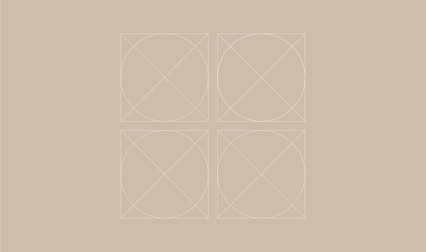
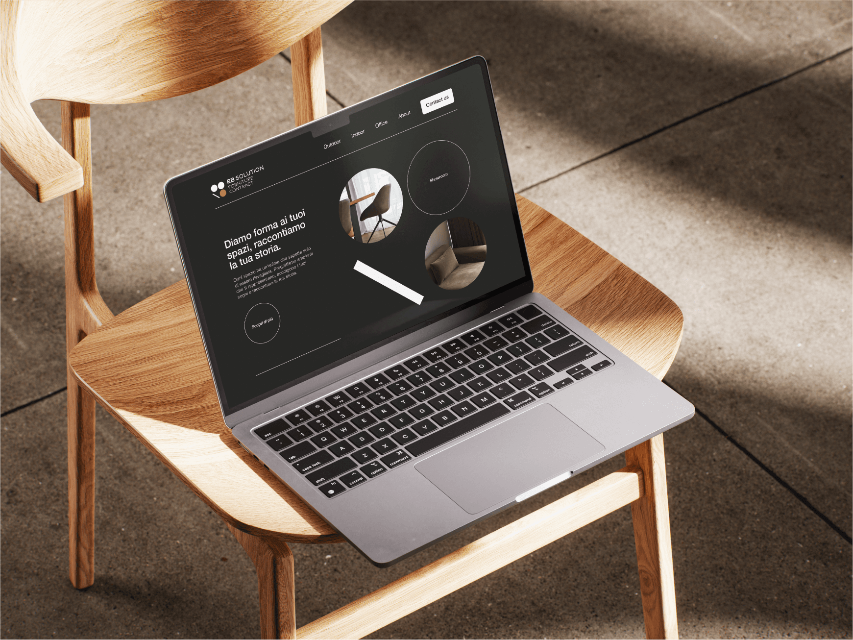
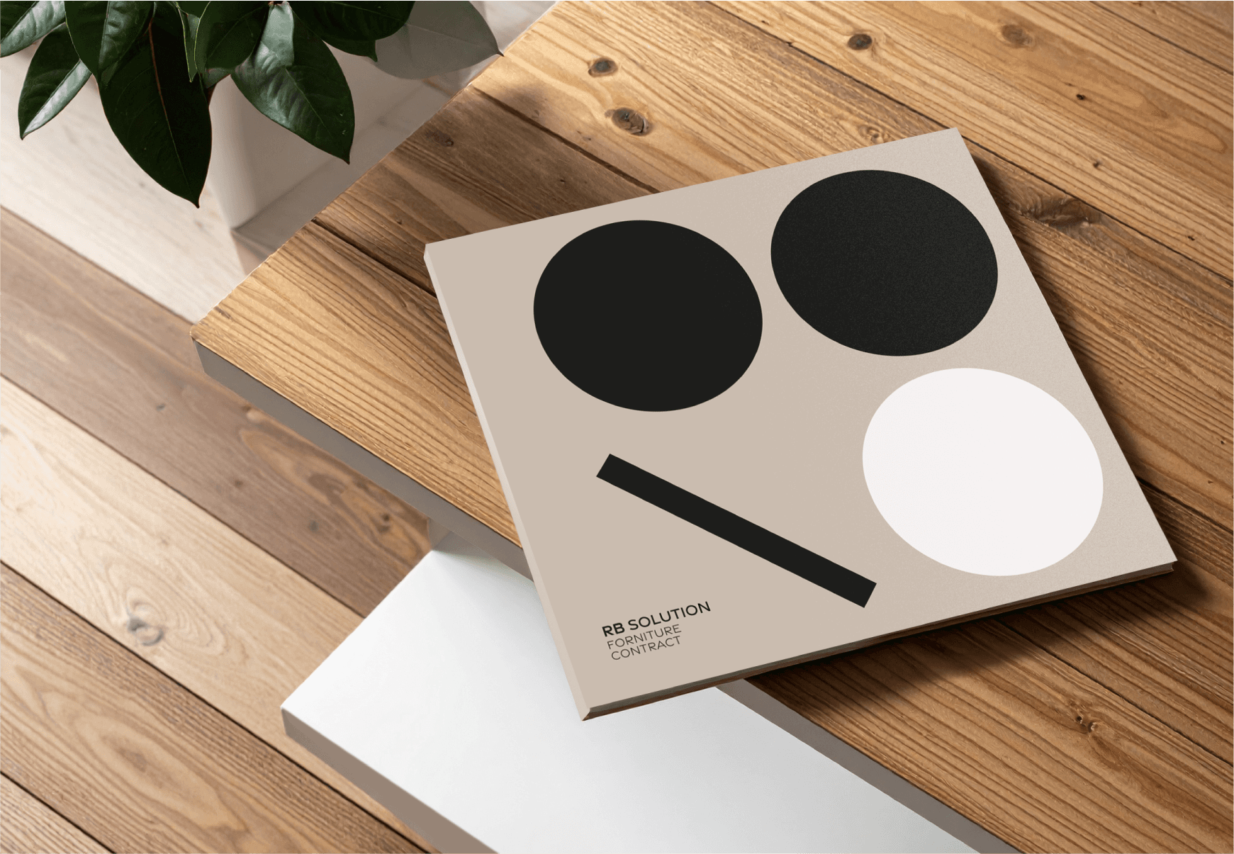
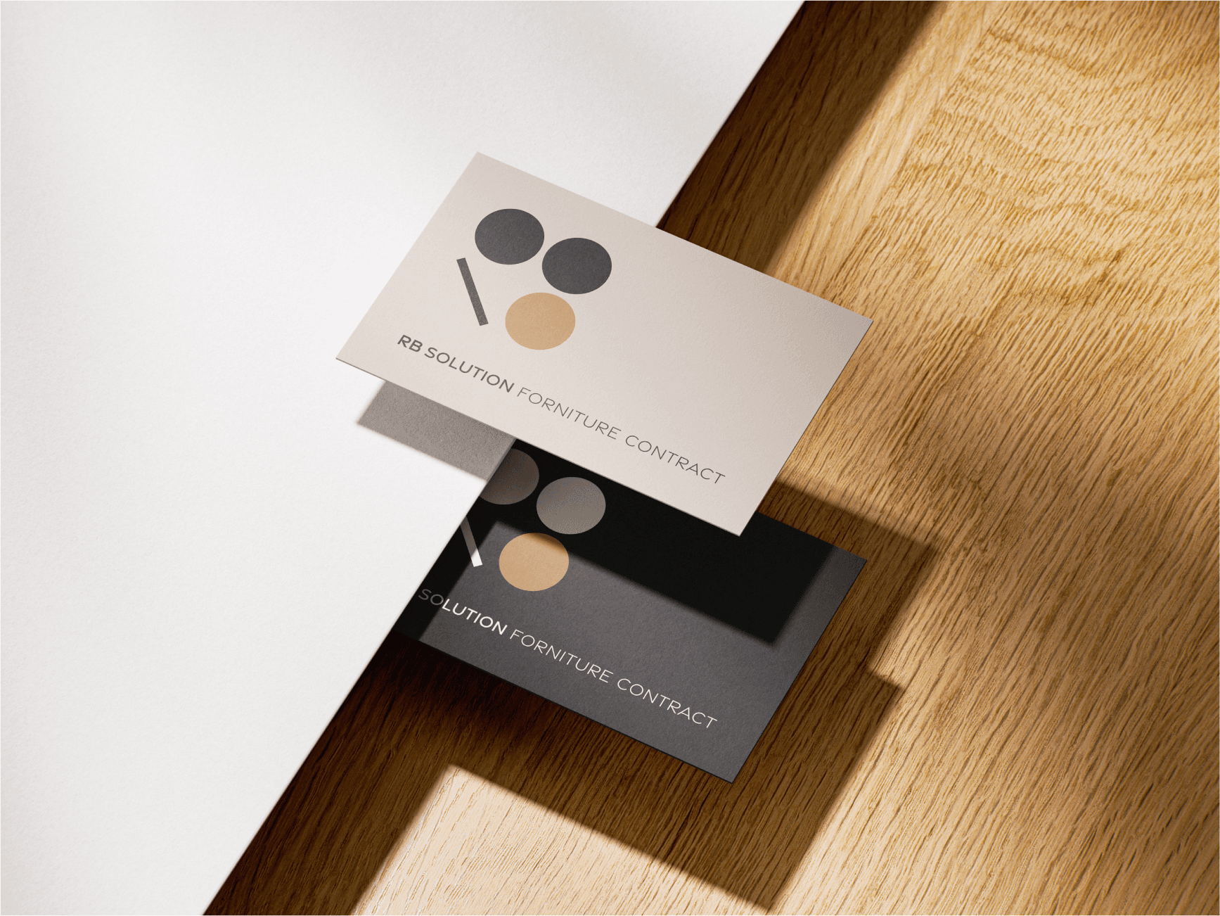
For RB Solution, I designed the studio’s logo and visual identity with the goal of positioning the brand competitively, making it both recognisable and distinctive. The concept is based on essential geometry — the circle and the line — evoking the modularity and structural logic of architectural space. Using these key elements, I reconstructed the letters “R” and “B”, creating a minimal, refined, and elegant logotype.
Client
RB solution – Created during my collaboration with Creostudios S.p.a.
DELIVERABLES
Logo design Visual identity UI design
Year
2022
Role
Art Director, Designer
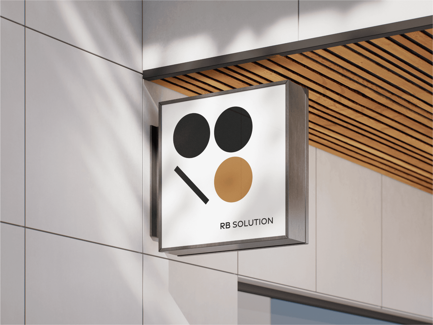
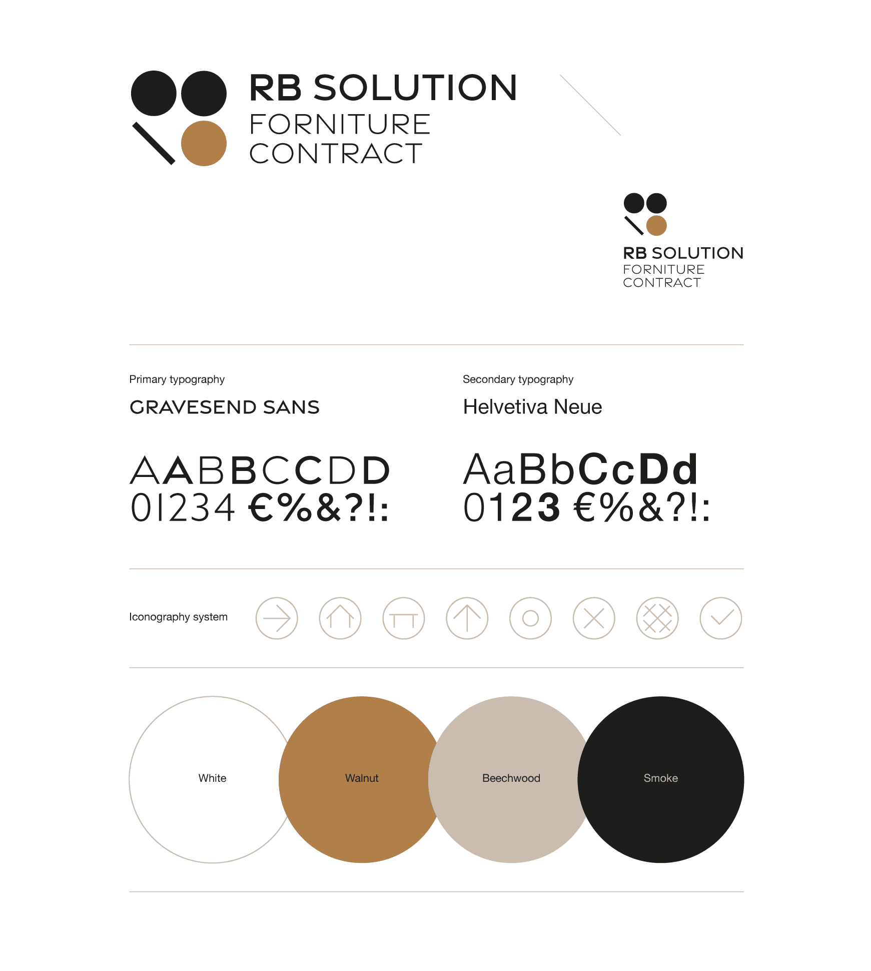

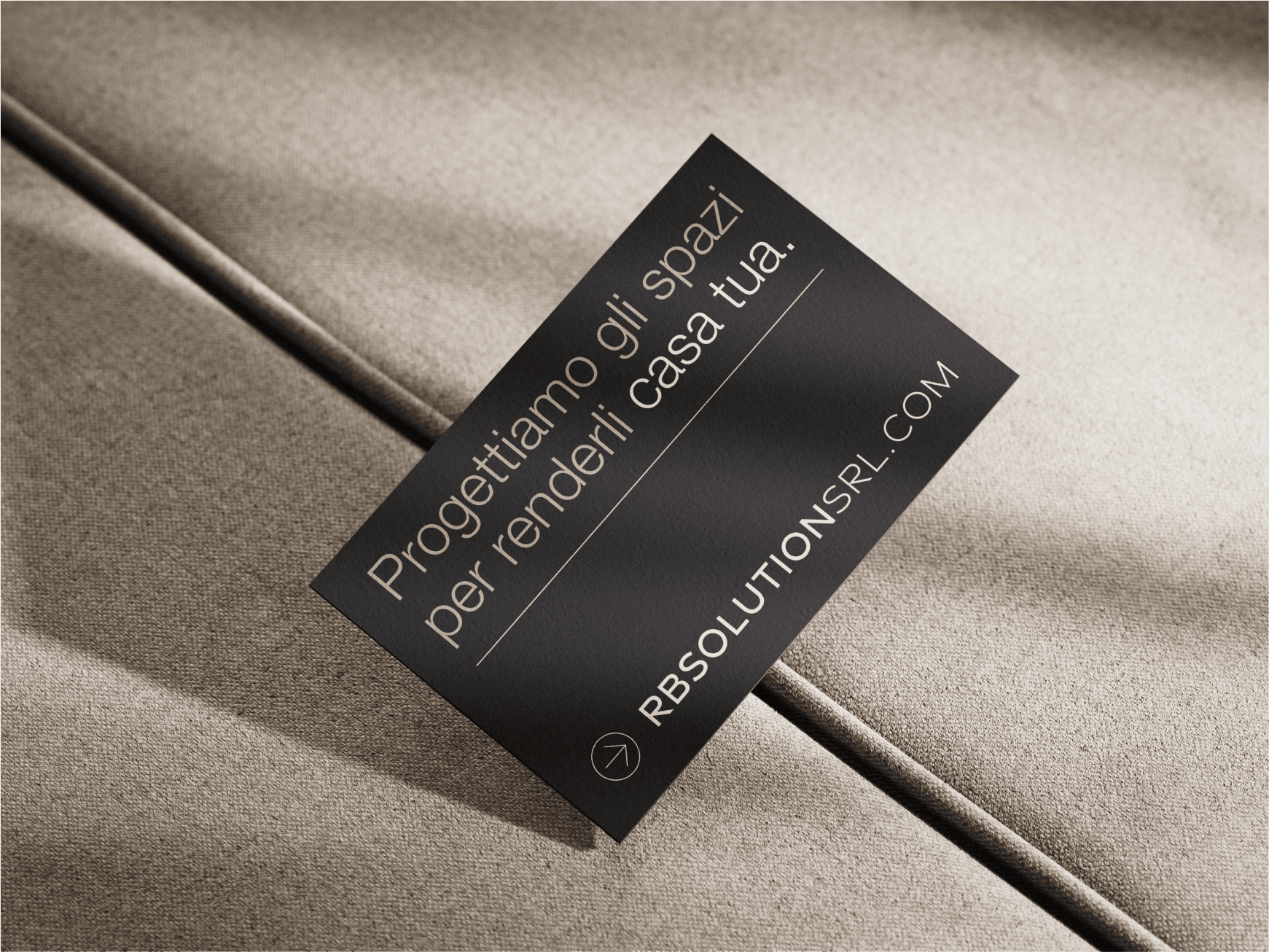
The colour palette combines warm, wood-inspired tones with charcoal black, creating a contrast that conveys solidity and character.
The design is crafted to communicate order, balance, and clarity, while also reflecting the personality and vision of RB Solution.